This Guy Is Sick And Tired Of BS Clickbait Ads
Nathan Johnson
Published
03/01/2018
in
facepalm
Clickbait ads are the worst and this guy is sick and tired of their bs.
- List View
- Player View
- Grid View
Advertisement
-
1.
 Ok, no. Just no. So I’m ok with sites having ads, really. But this CLICKBAIT BS is just too much. I scanned both images top to bottom. I was comparing EVERYTHING. Colors and shapes of the background, the angles of placement of STRAY HAIRS on both the girl and boy, THE LEVELS OF REFLECTIVITY ON EVERY APPARENTLY WET SURFACE, and I got NOTHING! But was I gonna click in hopes of finding out the answer only to be lead to some totally unrelated BS article? LIKE HELL I WAS! So I took a screenshot and got to work sciencing this shit out.
 -
2.
 First, I played with color hues and saturation, convinced the image on the left simply had a SLIGHT color filter applied to it, as evidenced by the left girl’s bathing suit apparently being a different shade of blue from the right and having a slightly different shadow lines. I was certain that was it, but the rest of the image aside from her bathing suit seemed to be exactly the same. Would someone seriously go through the effort of applying a BARELY noticeable color filter to only ONE PART of an image for the sake of a clickbait article?? I DON’T THINK SO! So I dug deeper... and deeper... AND THEN EMERGED WITH THE TRUTH TO SHARE WITH YOU ALL. And let me tell you, the truth is soo... disappointing.
 -
3.
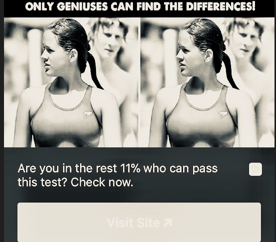 See the difference yet? Remember, only geniuses can see it... no? Here
 -
4.
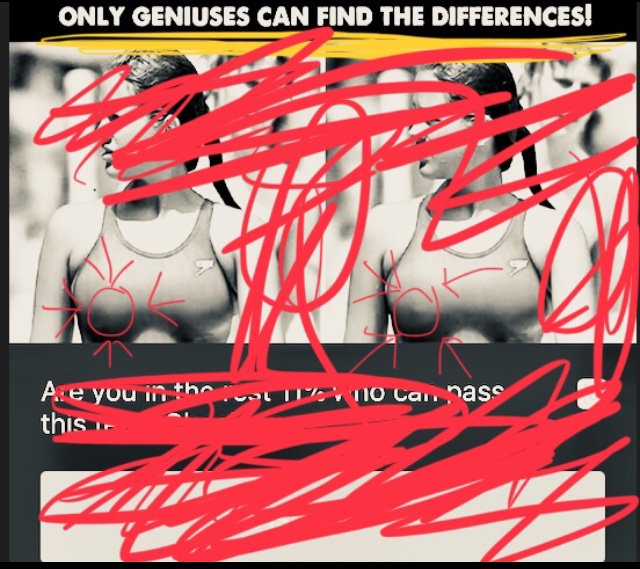 SCREW YOU AND YOUR STUPID TIT SLIP, ALA BOOBS IN THE THUMBNAIL CLICKBAIT ADS! I’m DONE, YOUR ADS HAVE AIDS!
 -
5.

- NEXT GALLERY
-

- Nonchalant Compilation of 32 Remarkable Images
Ok, no. Just no. So I’m ok with sites having ads, really. But this CLICKBAIT BS is just too much. I scanned both images top to bottom. I was comparing EVERYTHING. Colors and shapes of the background, the angles of placement of STRAY HAIRS on both the girl and boy, THE LEVELS OF REFLECTIVITY ON EVERY APPARENTLY WET SURFACE, and I got NOTHING! But was I gonna click in hopes of finding out the answer only to be lead to some totally unrelated BS article? LIKE HELL I WAS! So I took a screenshot and got to work sciencing this shit out.
5/5
1/5
Categories:
Facepalm






10 Comments